
Sputnik Cold Brew Coffee
Packaging • Photography
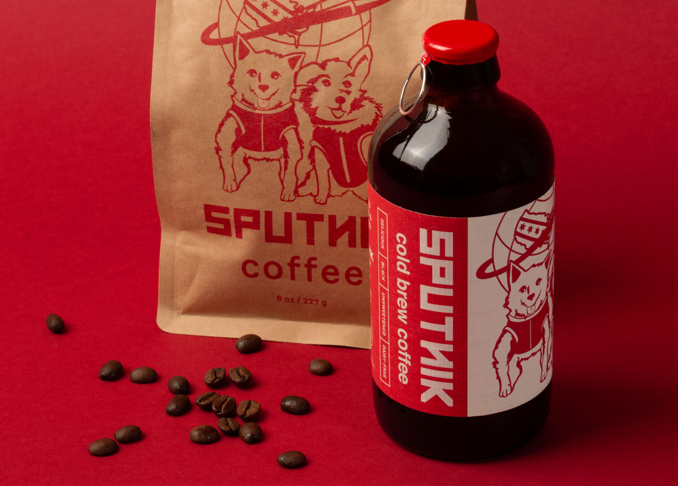
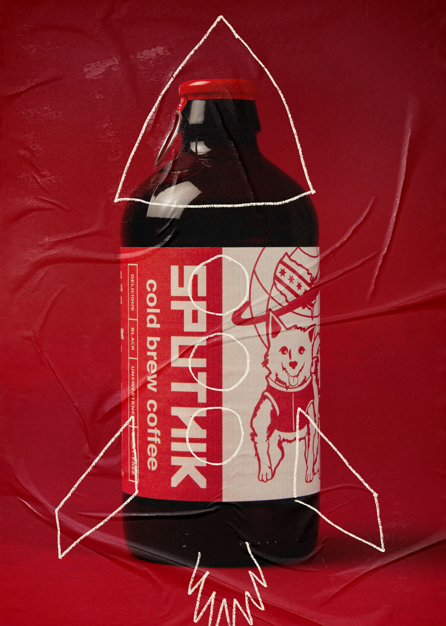
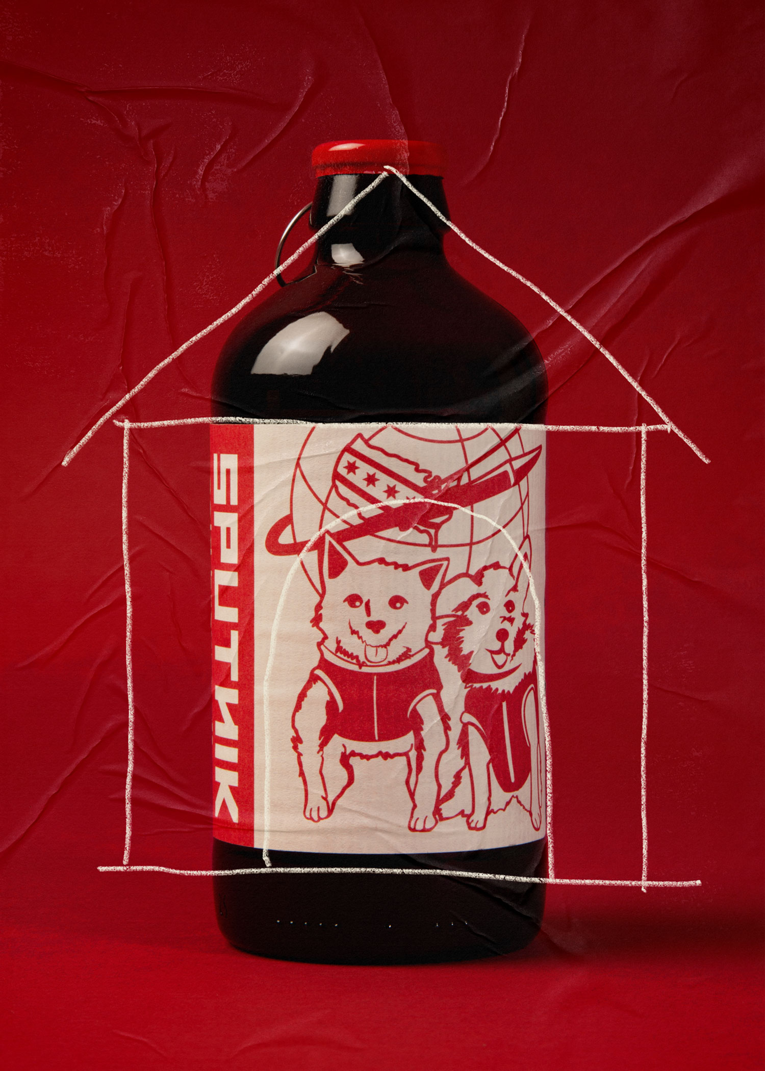
The brand's cute and quirky space dog illustration differentiates the coffee on the shelf and has become a key piece of the brand's story – it has also gained quite a loyal following in the Chicago area. We made sure that the pups have a dominant presence on the cold brew label while building a clean new type-driven architecture around the logo.
Since the roastery and cafe are located in a predominantly spanish-speaking neighborhood, we included both English and Spanish languages on the label. This helps Sputnik's cold brew stand out on shelf by speaking directly to their Spanish-speaking customers throughout the midwest.
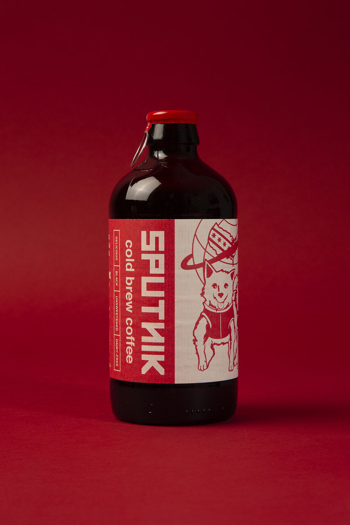
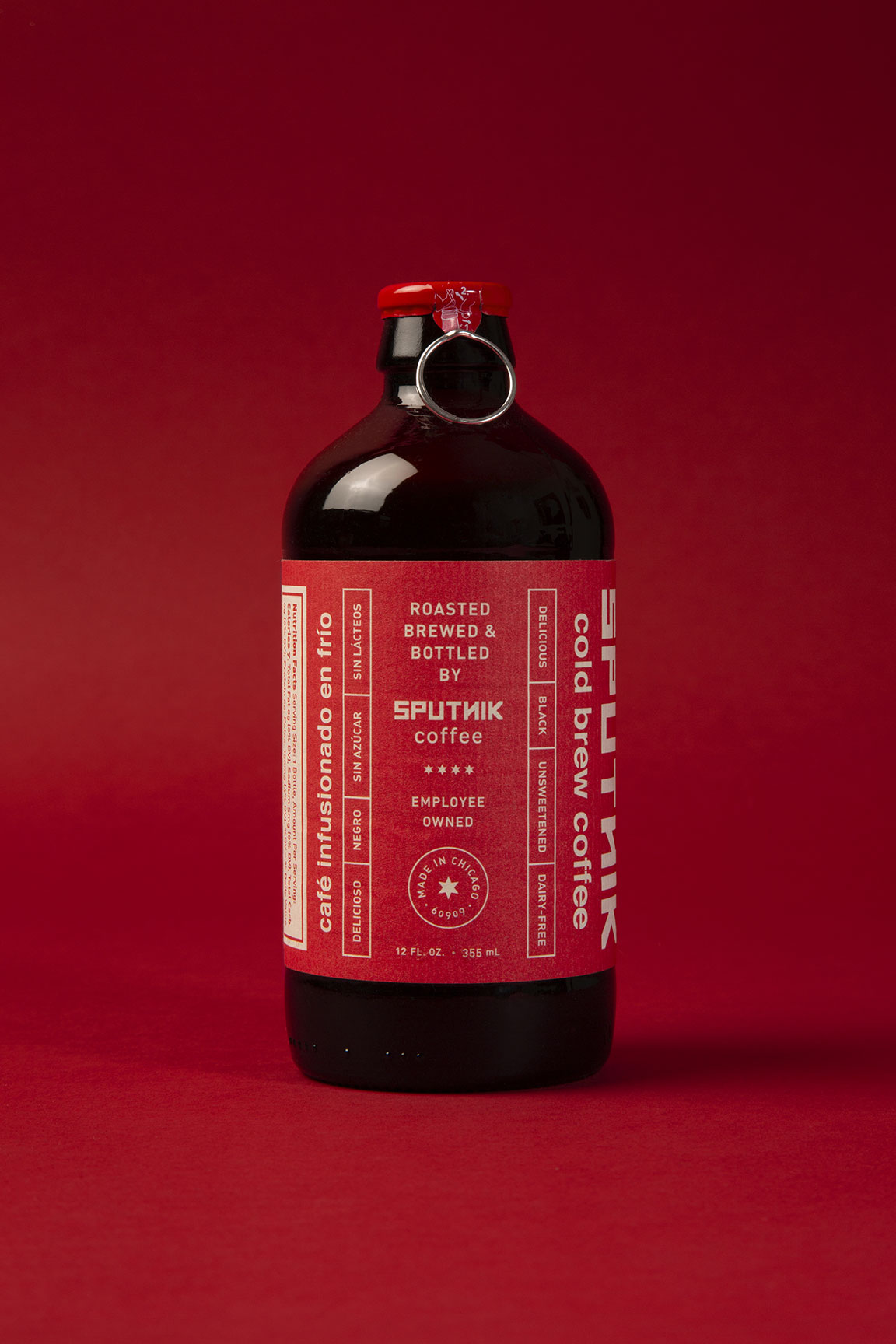
We chose old school paper labels combined with a unique pull tab cap to create a unique look that adds to the experience of opening the cold brew. The texture of paper labels feels nice to the touch and gives a more craft feel and look in a world where many brands are going for clean and sleek.