


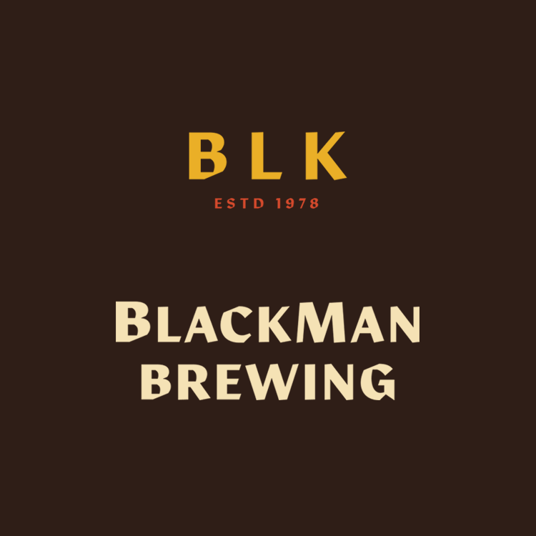
BlackMan Brewing
Creative Direction • Branding • Packaging
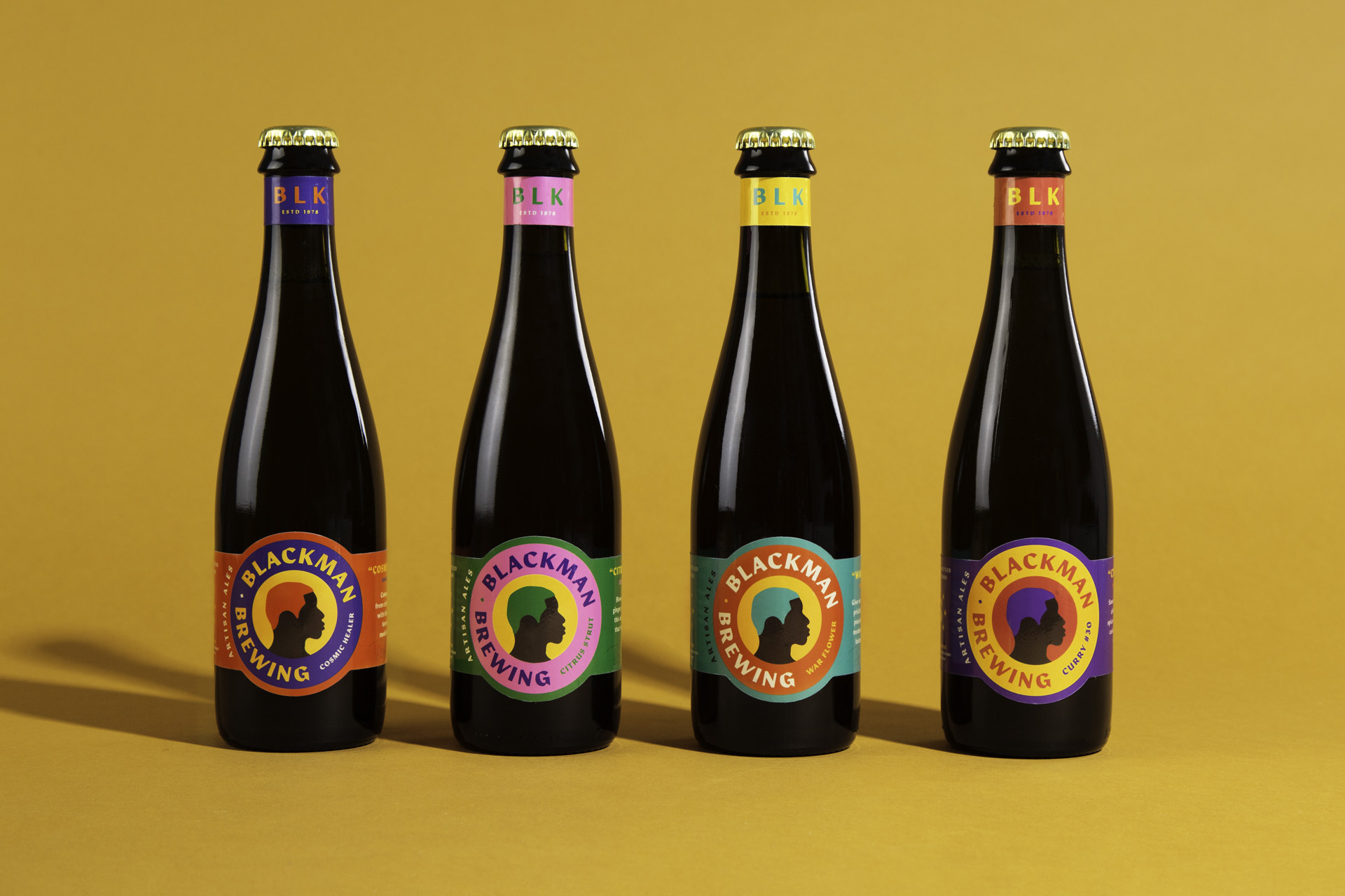
After leaving a full-time position at a commercial brewery, Barrett Tillman focused on growing his homebrew brand of sour and experimental beer with a fresh look. We took the elements of his original labels and designed a colorful system around a bold silhouette.
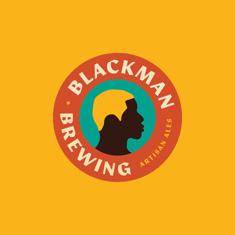
Each release's label colors are thoughtfully explored and chosen based on the ingredients, name, and inspiration behind each beer.
While a traditional craft brewery may need only a handful of new labels per year, a small operation like Barrett's is only limited by his own creativity. The brand's boldness and simplicity allow for quick iteration through color and text changes giving him more time and energy for the experimentation.
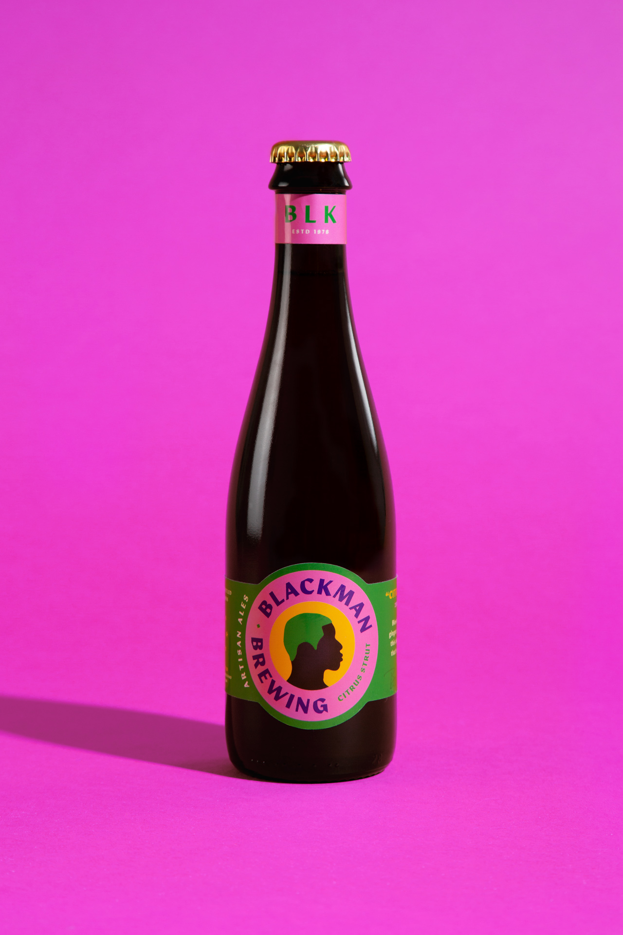
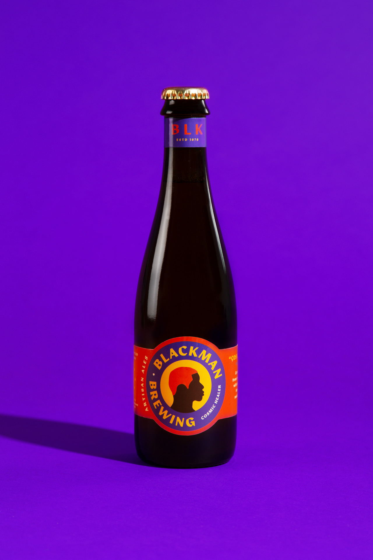
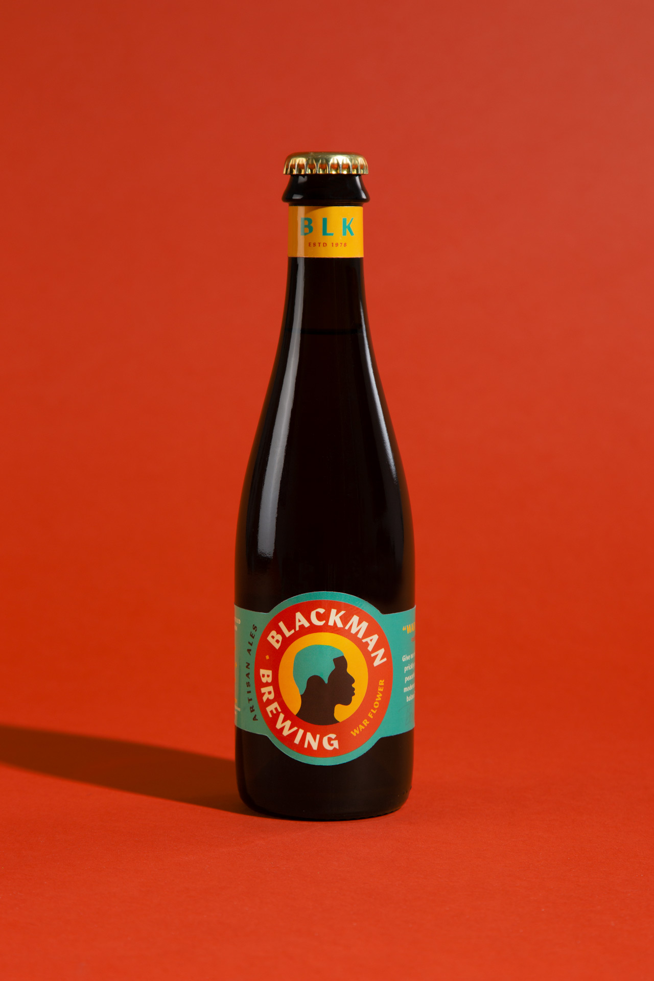
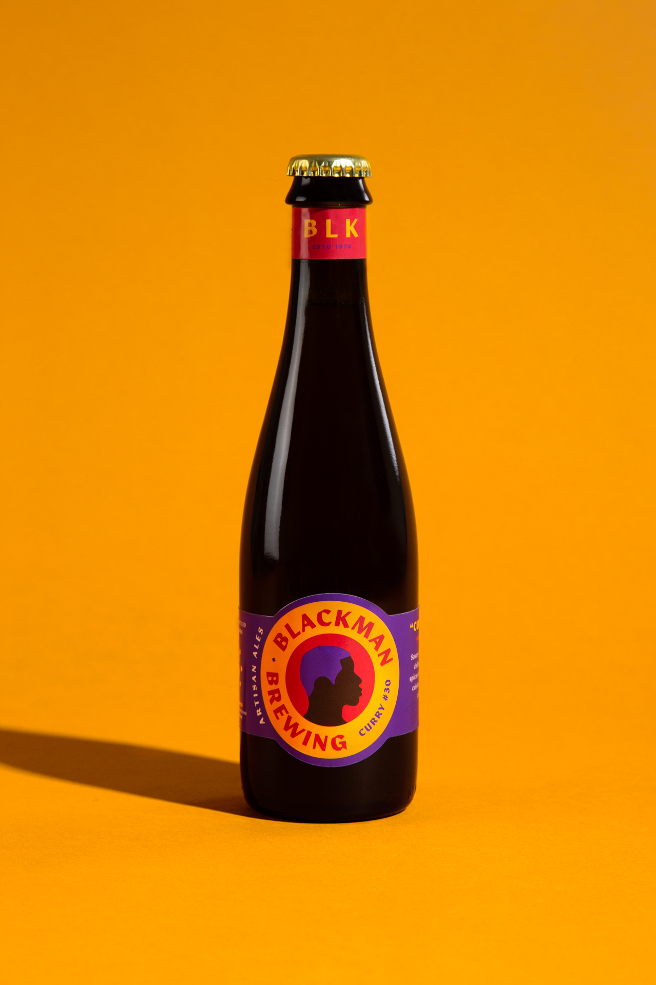
The silhouette was originally intended to be transparent to allow the bottle's glass color to show through. However, at the time of proofing, the transparent label material limited the brightness of the rest of the label.

BARRETT TILLMAN, FOUNDER & BREWER AT BLACKMAN BREWING